Random Data Generation & Data Visualization with Python
In this blog post, we’ll utilize the powerful libraries Matplotlib, Numpy and Pandas to perform data generation and visualization. We’ll discuss the programming concepts, methods, and functionalities used in this script.
After reading this article you will be familiar with the following python programming concepts
- Data Generation - We will look at three different methods to simulate data.
- Random points using
numpy.random.uniform() - sine wave function
numpy.sin() - Random Walk
numpy.random.normal()andnumpy.cumsum()(to simulate historical stock price data)
- Random points using
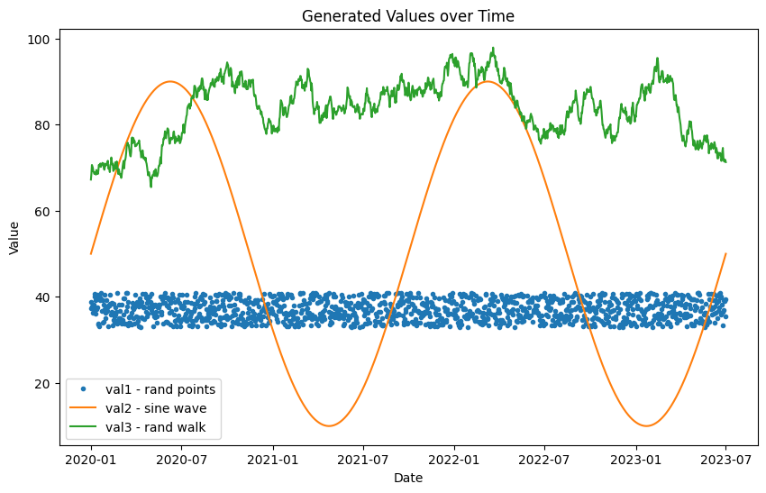
- Data Plotting - We will use matplotlib to visualize our data, plotting the three different data series onto the same chart.
Python Concepts Used in the Script
Importing Libraries
Libraries are a collection of pre-combined codes that can be used iteratively to reduce the time and effort spent on coding. We import three essential libraries for our task:
import pandas as pd
import numpy as np
import matplotlib.pyplot as plt
- Pandas: A library providing high-performance, easy-to-use data structures (like DataFrames) and data analysis tools.
- NumPy: A library for the Python programming language, adding support for large, multi-dimensional arrays and matrices, along with a large collection of high-level mathematical functions.
- Matplotlib: A plotting library for creating static, animated, and interactive visualizations in Python.
Date Range Generation
To start with we will generate a date range that will be used as the index for our DataFrame.
# Define the date range
date_range = pd.date_range(start='2020-01-01', end='2023-07-01', freq='D')
Generating Random Data
Let’s look at three different ways to generate data for our simulation.
Optionally, we will set a random seed of 0. This causes random data to output the same each time so your random data will look just like mine here.
# Set random seed
np.random.seed(0)  # for reproducibility
# Generate Random values between 33 and 41
val1 = np.random.uniform(33, 41, len(date_range))
The numpy.random.uniform() function generates a uniform random sample from a given range.
Generating a sine wave
# Sine wave values between 10 and 90
val2 = 40*np.sin(np.linspace(0, 4*np.pi, len(date_range))) + 50
np.sin() and np.linspace() are used to generate a sine wave.
Generating with random walk
# Simulate stock price history in a range of 14-120 using a simple random walk model
initial_price = 67  # Set an initial price in the middle of 14-120

random_walk = np.random.normal(0, 1, len(date_range))
val3 = np.cumsum(random_walk) + initial_price

# Make sure the simulated stock price stays within the 14-120 range
val3 = np.clip(val3, 14, 120)
Above, we can simulate stock price data by using numpy.random.normal and numpy.cumsum to implement the random walk model.
numpy provides a long list of random generators which you can find here.
Creating a DataFrame
Next, we will assembly our date range date_range and three random data series val1, val2, and val3 into a pandas dataframe.
Pandas DataFrames are two-dimensional tabular data structures with labeled axes (rows and columns). In this script, we use a dictionary to create a DataFrame. Each key-value pair in the dictionary corresponds to a column in the DataFrame.
df = pd.DataFrame({
    'date': date_range,
    'val1': val1,
    'val2': val2,
    'val3': val3
})
Setting the DataFrame Index
The index of a DataFrame is a set that can hold the label for each row. Here, we set ‘date’ as the index of our DataFrame using the df.set_index() function.
df.set_index('date', inplace=True)
Plotting the Data
The final part of the script uses Matplotlib to visualize the data. Each series can be plotted with a different style. For instance, the ‘val1’ series is plotted as dots by setting linestyle='None' and marker='.'.
# Print DataFrame
print(df.head())

# Plot the data
plt.figure(figsize=(10,6))

plt.plot(df['val1'], linestyle='None', marker='.', label='val1 - rand points')
plt.plot(df['val2'], label='val2 - sine wave')
plt.plot(df['val3'], label='val3 - rand walk')

plt.xlabel('Date')
plt.ylabel('Value')
plt.title('Generated Values over Time')
plt.legend()
plt.show()
Matplotlib’s plt.legend() and plt.show() functions are used to display a legend and the plot, respectively.

Conclusion
Python, with its powerful libraries like Pandas and Matplotlib, can make data generation and visualization an
easy task. Understanding these concepts and methods can help you in a wide range of applications, from data analysis to machine learning, and more. Happy coding!
In this blog post, we discussed various programming concepts used in a Python script that generates and visualizes data. We hope you found this post informative and useful for your own Python endeavors!
Source Code
Here is the complete python code:
import pandas as pd
import numpy as np
import matplotlib.pyplot as plt

# Define the date range
date_range = pd.date_range(start='2020-01-01', end='2023-07-01', freq='D')

# Set random seed
np.random.seed(0)  # for reproducibility

# Generate Random values between 33 and 41
val1 = np.random.uniform(33, 41, len(date_range))

# Sine wave values between 10 and 90
val2 = 40*np.sin(np.linspace(0, 4*np.pi, len(date_range))) + 50

# Simulate stock price history in a range of 14-120 using a simple random walk model
initial_price = 67  # Set an initial price in the middle of 14-120
random_walk = np.random.normal(0, 1, len(date_range))
val3 = np.cumsum(random_walk) + initial_price

# Make sure the simulated stock price stays within the 14-120 range
val3 = np.clip(val3, 14, 120)

# Create DataFrame
df = pd.DataFrame({
    'date': date_range,
    'val1': val1,
    'val2': val2,
    'val3': val3
})

# Set 'date' as index
df.set_index('date', inplace=True)

# Print DataFrame
print(df.head())

# Plot the data
plt.figure(figsize=(10,6))
plt.plot(df['val1'], linestyle='None', marker='.', label='val1 - rand points')
plt.plot(df['val2'], label='val2 - sine wave')
plt.plot(df['val3'], label='val3 - rand walk')
plt.xlabel('Date')
plt.ylabel('Value')
plt.title('Generated Values over Time')
plt.legend()
plt.show()
Resulting Graph

 pythonfix


